ROMWOD
Brand Books + Guidelines
THE BREAKDOWN:
Challenge
As an ever-evolving brand, ROMWOD was seeking a way to provide a source of truth for all things brand related that could be shared across any team touching the brand: design, website devs, UI/UX teams, photographers, app development teams, partnering brands, etc. so that they could maintain a consistent brand look and feel.
Solution
We created a highly in depth brand book that touched on every aesthetic aspect of the brand. From silos of photography content to font spacing to digital design elements to in-person events, this guide would be something that anyone could pick up and have crystal clear instructions on how to create something that felt true to the brand and maintained a consistent branding appearance.
THE Process:
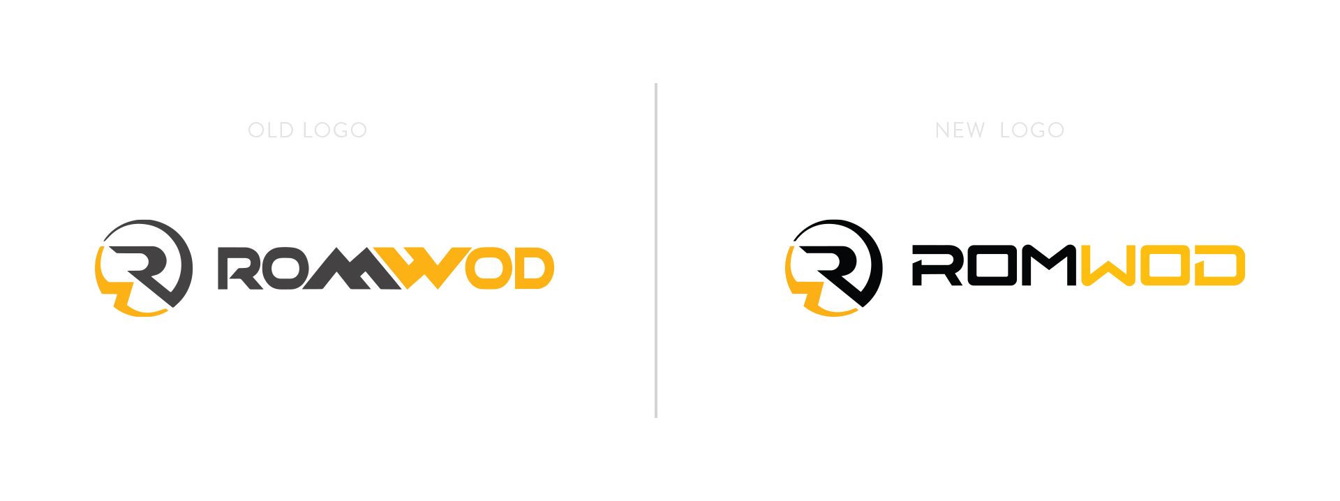
Starting with some of the more basic concepts: logo placement, spacing, cobranding, and color hierarchy our team laid out the exact specifics of how we expected the logo to be treated and how to distinguish how to use the different color variants of the logo.
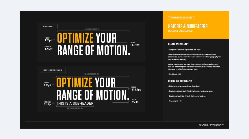
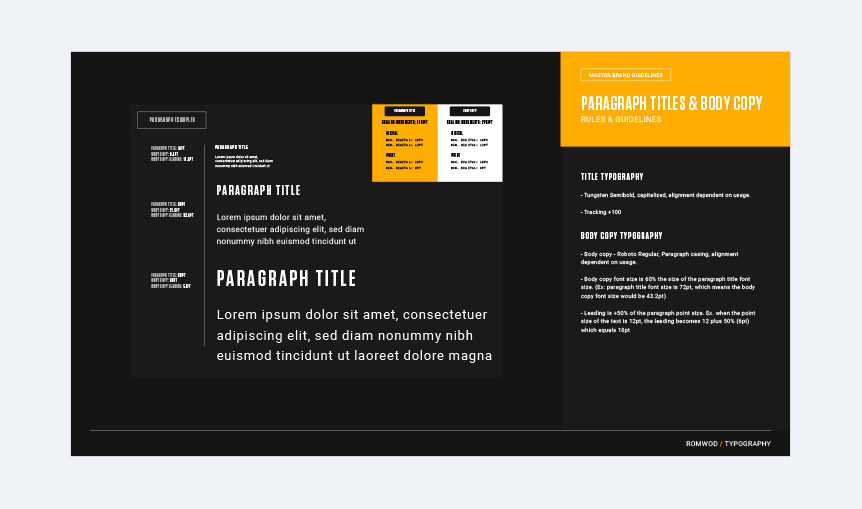
We also created exact mathematical formulas on spacing and sizing for text headers, subheads, and body copy. For non-text symbols, our team created a specific custom library of icons for all the main poses as well as any other icons that would need to be used within the app or website.

Photography:
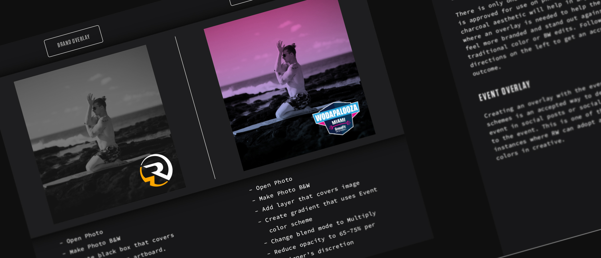
When hiring photographers, we outlined the most common types of photography that the brand typically uses, as well as how to treat color and black + white photos in post-production in order to achieve a consistent brand look.

Digital vs. Ecomm
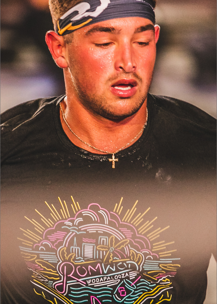
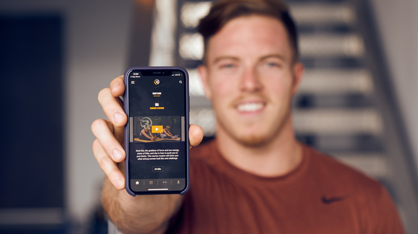
As a highly digitally-based brand, we dedicated entire sections to UI elements, ad creation, and videography. Also recognizing the ecommerce aspect of the brand, we outlined the appropriate places where apparel could contain branding and designs. Our team also highlighted the difference between core branded mats and apparel vs. limited edition and collaborative designs.
Environmental:
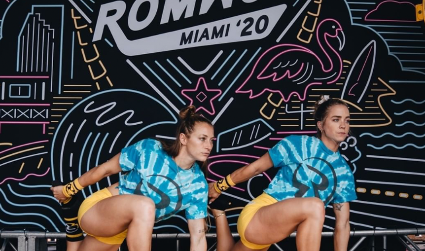
Recognizing that the brand has multiple events a year that they have a large physical presence and may want to expand beyond the stringent digital brand guidelines, we set an acceptable variance from the traditional branding to allow ROMWOD to play off the event aesthetic and adapt to some different looks that otherwise might not be allowed in the digital space.
